
Earlier this week, Real, a technology powered brokerage, unveiled it's new brand, including an updated logo, to reveal a more sophisticated feel. As agents need to know that they can trust Real, the team has designed a new look, which emphasizes the company's Real as a authoritative and sturdy entity. The subtle curves and rigid grid give this logo a tech-savvy feel, while its rectangular shape gives it a solid and comforting disposition, similar to a home.
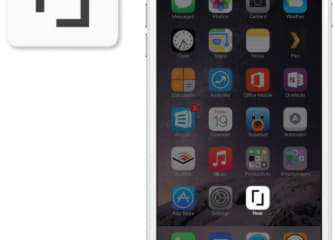
Phone Icon - The 'R' and 'L' from the logo were used to form the icon. This graphic element establishes simple brand recognition and allows for a diverse amount of applications.


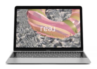
Photography Direction - We wanted to create a unique visual direction that set the Real brand apart. The visual texture needed to be appealing and welcoming to both agents and their clients. As such, we created a filter (or overlay) on all photos that incorporates warm hues of pink, tan, and blues. The idea was, when your client sees an image or yard sign from Real, they KNOW who you are.
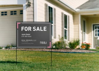
Yard Sign Mockup
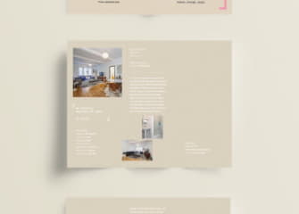
Brochure Mockup

Ad Mockup

Business Cards

